Marga
Strategic analysis, full rebrand — from the new logo to the visual identity system — website, communication materials and a LinkedIn plan for a company with over 20 years in general contracting and facility management.
Project overview
Marga (Mar.Ga.) is a company with over 20 years of experience in construction, renovation and facility management of medium- and large-scale properties, with more than 4,000 projects delivered. Its identity lives on a dual soul — Service and Contract — which the rebrand set out to make readable and consistent across every touchpoint.
As project manager I coordinated a creative and development team across the full rebrand. The work started from a strategic analysis of the company, its positioning and its reference market, to build a solid base for redesigning the identity and clearly conveying quality, reliability and professionalism.
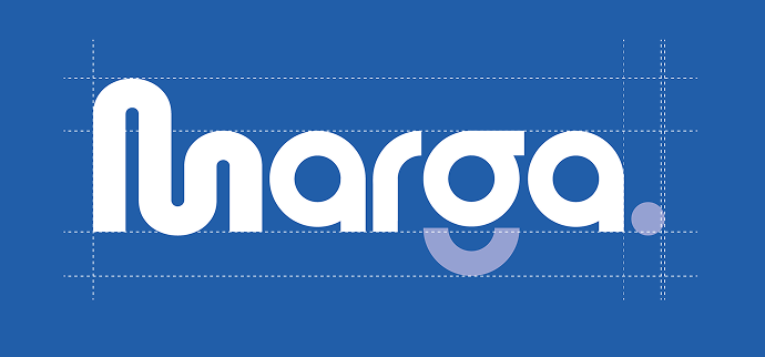
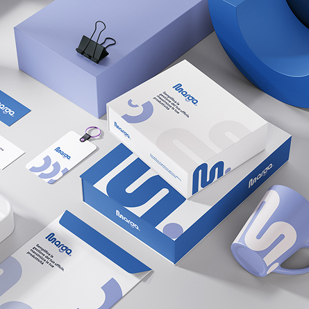
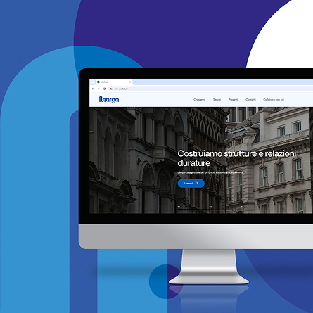
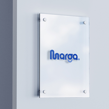
From there we worked on a new logo, designed to hold the Service–Contract duality inside a single mark, and on the full visual identity system: brand system, print and digital collateral, application on the office plaque, stationery and physical touchpoints. In parallel we designed and developed a completely rethought website — clear architecture, intuitive UX and SEO optimisation — to bring the two pillars of the offering online.
To close the loop, I coordinated — and partly ran directly — the launch of the LinkedIn company page, the editorial plan and a dedicated advertising campaign, to place the new identity in front of the B2B audience.
Challenge
Fully refresh Marga's presence and finally make its dual soul — Service and Contract — legible, through a distinctive visual identity, a performant website and coordinated communication that conveys quality, reliability and professionalism.
Solution
An end-to-end rebrand: strategic analysis, a new logo capturing the Service–Contract duality, a visual identity system extended to stationery and physical touchpoints (including the office plaque), a website rethought around UX and SEO, aligned communication collateral, and the activation of the LinkedIn presence with a dedicated advertising campaign.
Impact
- •Full rebrand from logo to visual identity across company touchpoints
- •A website rethought around clear architecture, intuitive UX and SEO
- •Communication collateral (brochure, corporate deck, stationery) aligned with the new identity
- •A new LinkedIn presence with an editorial plan and dedicated B2B advertising
Gallery
Delivery process
Strategic analysis
Analysis of the company, its positioning and its reference market in general contracting and facility management, to define the strategic foundations of the rebrand and frame the Service–Contract duality.
Logo & visual identity
Designing the new logo to hold the Service–Contract duality in a single mark, with its full visual identity: system, palette, stationery and physical touchpoints (office plaque included).
Website & SEO
Design and development of the new website with clear architecture and intuitive UX, built to tell the two pillars of the offering at a glance, with on-page SEO for organic ranking.
Collateral & LinkedIn
Producing communication collateral (brochure, corporate deck, stationery), launching the LinkedIn page, defining the editorial plan and directly running an advertising campaign to place the new identity in front of the B2B audience.
Team
- AB
Andrea Bellati
Project Manager & Account Manager
- TC
Team Creativo
Brand strategy, logo & visual identity
- TW
Team Web
UX/UI, website build & SEO